Notification
Color
Low contrast
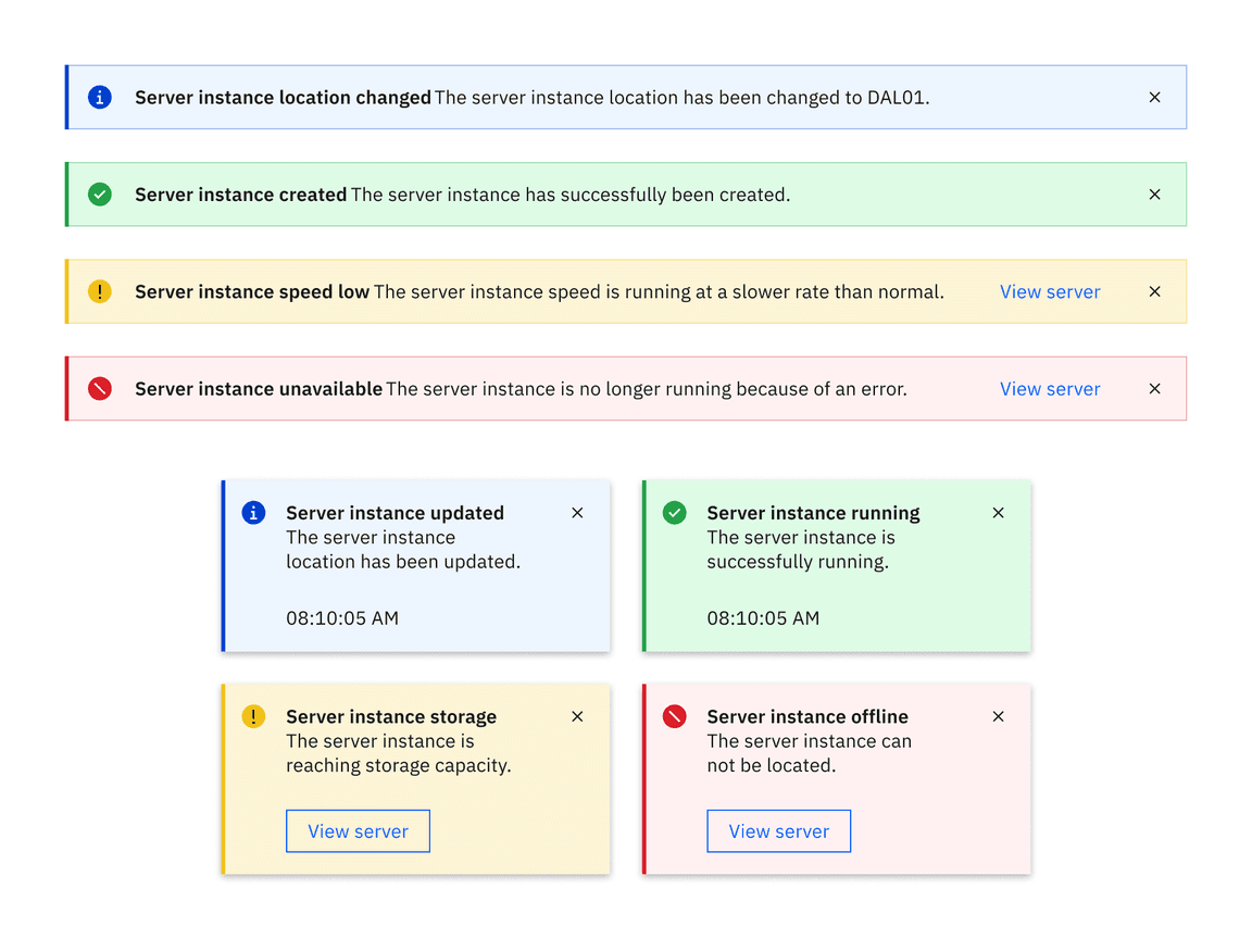
Low contrast notifications in the White theme
| Element | Property | Color token |
|---|---|---|
| Title | text color |
|
| Subtitle | text color |
|
| Close button | fill |
|
| Error | background-color |
|
| border-left |
| |
| svg |
| |
| Success | background-color. |
|
| border-left |
| |
| svg |
| |
| Warning | background-color |
|
| border-left |
| |
| svg |
| |
| Information | background-color |
|
| border-left |
| |
| svg |
|
High contrast
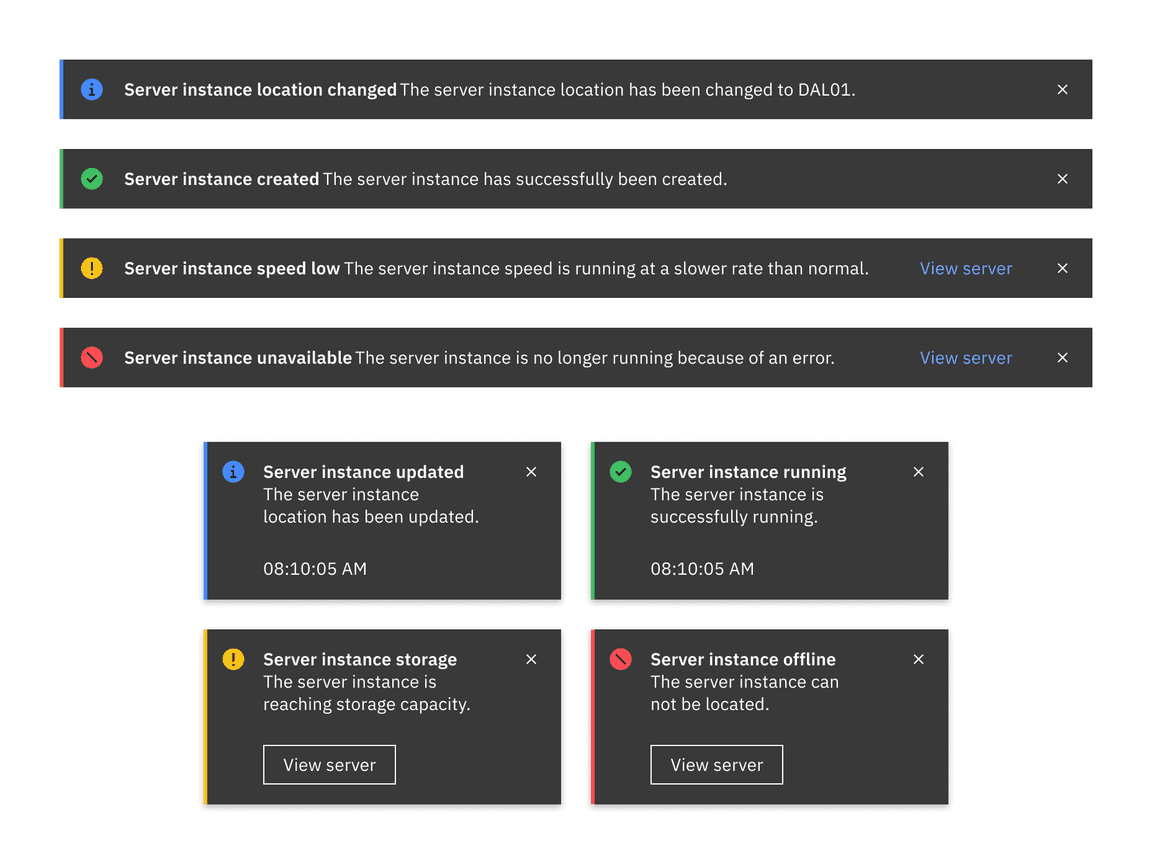
High contrast notifications in the White theme
| Element | Property | Color token |
|---|---|---|
| Title | text color |
|
| Subtitle | text color |
|
| Close button | fill |
|
| Background | background-color |
|
| Error | border-left |
|
| svg |
| |
| Success | border-left |
|
| svg |
| |
| Warning | border-left |
|
| svg |
| |
| Information | border-left |
|
| svg |
|
Typography
Write notifications in sentence case, which means only the first word is capitalized. Notification titles should be concise and to the point.
| Element | Font-size (px/rem) | Font-weight | Type token |
|---|---|---|---|
| Title | 14 / 0.875 | SemiBold / 600 |
|
| Subtitle | 14 / 0.875 | Regular / 400 |
|
Structure
Toast
| Element | Property | px / rem | Spacing token |
|---|---|---|---|
| Notification | width | 288 / 18 | – |
| border-left | 3px | – | |
| padding-right | 16 / 1 |
| |
| Title | margin-top | 16 / 1 |
|
| Subtitle | margin-bottom | 24 / 1.5 |
|
| Details | padding-right | 16 / 1 |
|
| Caption | margin-bottom | 16 / 1 |
|
| Close button | height, width | 48 / 3 | – |
| Close icon | margin-top, margin-right | 16 / 1 |
|
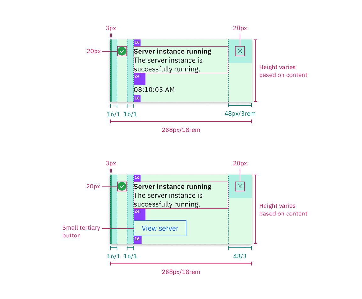
Structure and spacing measurements for a toast notification | px / rem
Inline
The width of an inline notification will vary based on content or layout.
| Element | Property | px / rem | Spacing token |
|---|---|---|---|
| Inline notification | min-height | 48 / 3 |
|
| border-left | 3px | – | |
| Details | margin-left, margin-right | 16 / 1 |
|
| Text-wrapper | padding-top, padding-bottom | 12 / 0.75 |
|
| Icon | margin-right | 16 / 1 |
|
| Close button | height, width | 48 / 3 | – |
| Close icon | icon size | 16 x 16 | – |
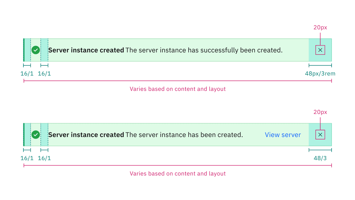
Structure and spacing measurements for an inline notification | px / rem
Callout
The width of a callout will vary based on content or layout.
| Element | Property | px / rem | Spacing token |
|---|---|---|---|
| Callout | min-height | 48 / 3 |
|
| border-left | 3px | – | |
| Details | margin-left, margin-right | 16 / 1 |
|
| Text-wrapper | padding-top, padding-bottom | 12 / 0.75 |
|
| Icon | margin-right | 16 / 1 |
|
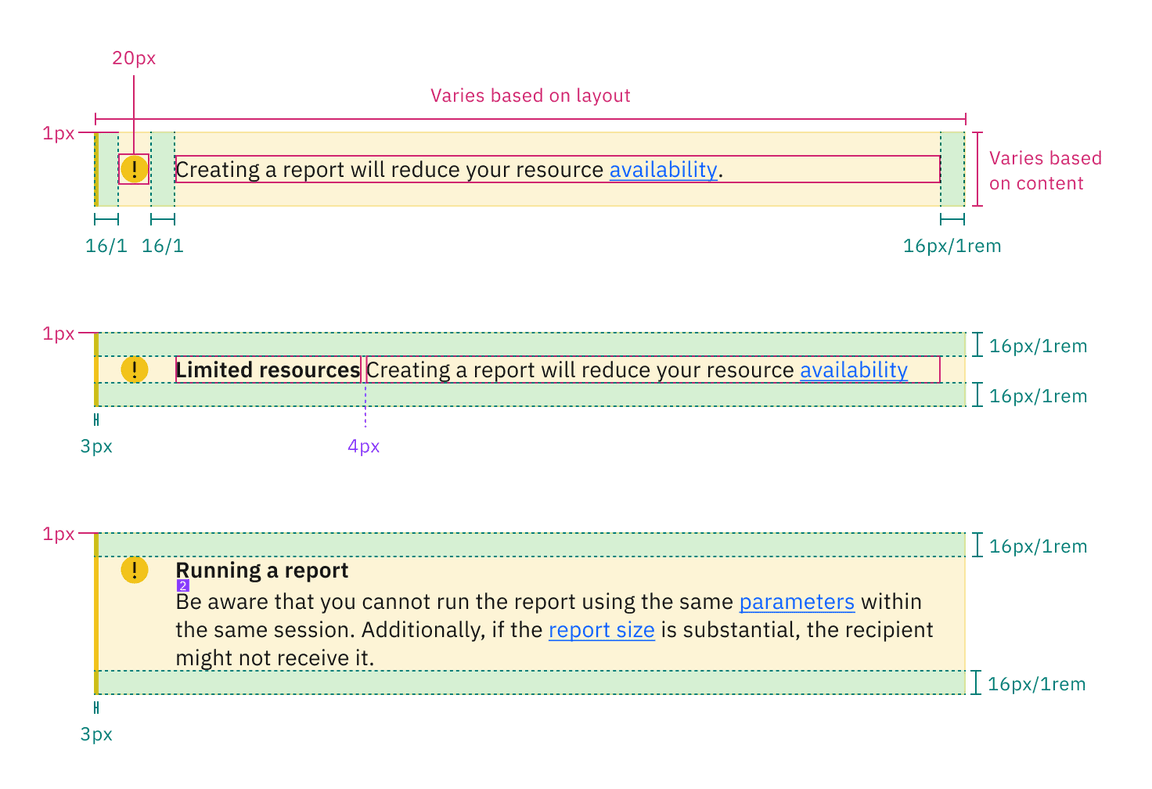
Structure and spacing for a callout | px / rem